
The Problem
Many animal shelters are getting overpopulated and need to make the pet adoption process as easy as possible, in order to find loving owners for the animals they shelter. They also need to easily collect donations or to offer volunteering opportunities to interested persons.
My Role
UX designer designing a responsive website that makes the pet adoption flow as simple as possible.
The Goal
The project looks to offer a seamless pet adoption process no matter what device the user is trying to access the website from.
Responsibilities
Conducting interviews, paper and digital wireframing, low and high-fidelity prototyping, conducting usability studies, accounting for accessibility, and iterating on designs.
The Product
The responsive web site is looking to facilitate pet adoptions, volunteering and collecting donations for a local animal shelter. It is designed for offering a cohesive experience on any device it is accessed from.
Project Duration
August 2021 to September 2021
Understanding the user
I conducted interviews and created empathy maps to understand the users I’m designing for and their needs. A primary user group identified through research was adults looking to adopt pets that get along well with children or with other pets.
This user group confirmed initial assumptions about the website’s visitors, but research also revealed that visitors would like to find testimonials of other persons that adopted pets from the animal shelter.
User Research: Pain Points
1. Visitors want a simple and straightforward pet adoption process.
2. The website needs to be accessible from the point of view of contrast between foreground and background colors and to offer relevant information regarding the pets that are up for adoption.
3. The experience needs to be consistent across devices, no matter the viewport size.
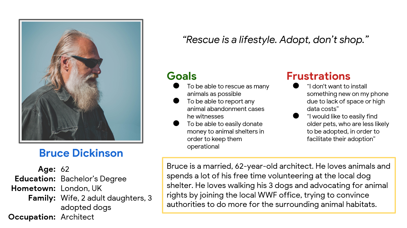
Persona & Problem Statement
Bruce Dickinson is a 62 year-old architect who needs to be able to easily filter for pets who get along with other animals because he already has 3 dogs at home.
Starting the design
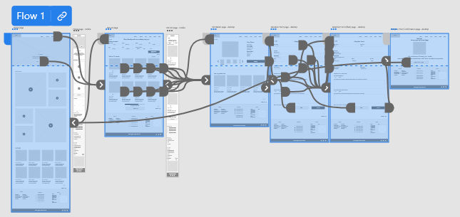
Sitemap
I created the website’s sitemap to guide the organizational structure of each screen’s design to ensure a cohesive and consistent experience across devices.

Paper wireframes
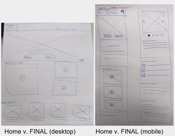
Taking the time to draft iterations of each page of the responsive website on paper ensured that the elements that made it to digital wireframes would be well-suited to address user pain points. Stars were used to mark the elements of each sketch that would be used in the initial digital wireframes.
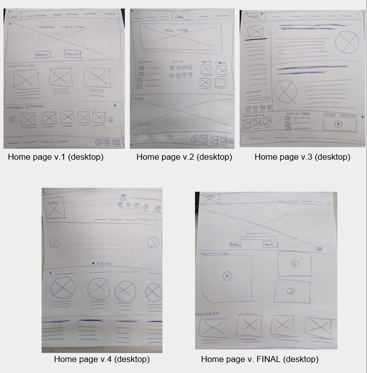
Paper wireframes screen size variation(s)
For the desktop version I used a combination between Featured Image and Grid layouts in order to focus the user’s attention on 3 main actions (adopt, donate & view testimonials).
For the mobile version I took a single column approach and used an image carousel to display the animal
Digital wireframes
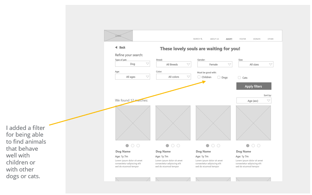
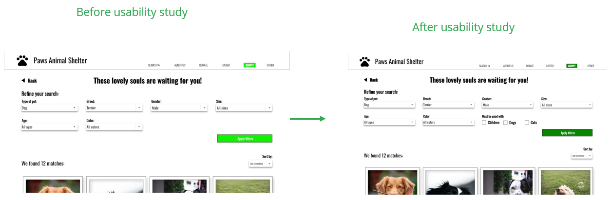
Conducting usability studies revealed the fact that users need some specific filtering criteria, which were then added to the designs.
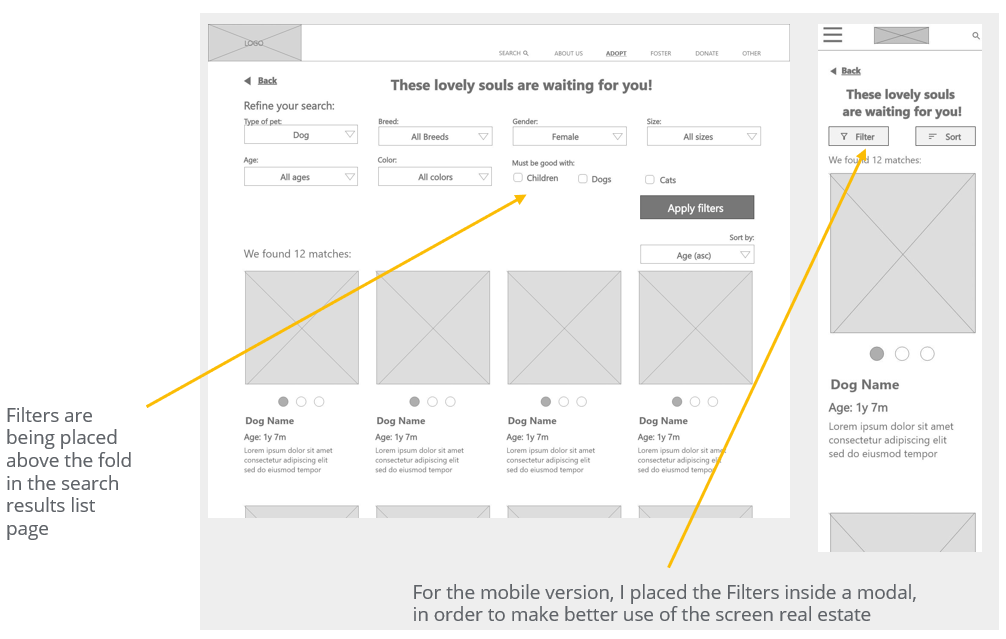
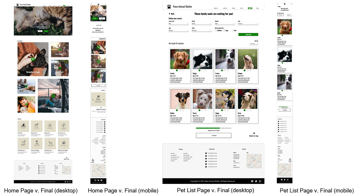
Digital wireframe screen size variation(s)
I needed to make the best use of the screen real estate on mobile, so I used a modal for the search results filter.
Low-fidelity prototype
I created a low-fidelity prototype to be used in the usability study meant for gathering user feedback about the pet adoption flow.
View the low-fidelity prototype
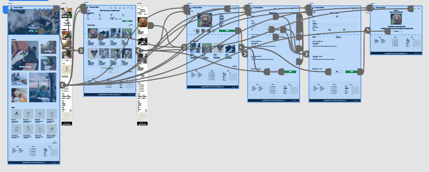
High-fidelity prototype
I then created a high-fidelity prototype for gathering feedback about the website look-and-feel. The high-fidelity prototype was used in an unmoderated usability study with 5 participants. Here are the main findings uncovered by the usability study:
1. Users needed more fine-grained filtering options
2. The color of the primary call-to-action buttons needed to be adjusted for accessibility reasons.
2. The color of the primary call-to-action buttons needed to be adjusted for accessibility reasons.
Mockups
The usability study revealed the fact that the color contrast for the primary CTA button was not passing accessibility guidelines, so the color contrast had to be adjusted.
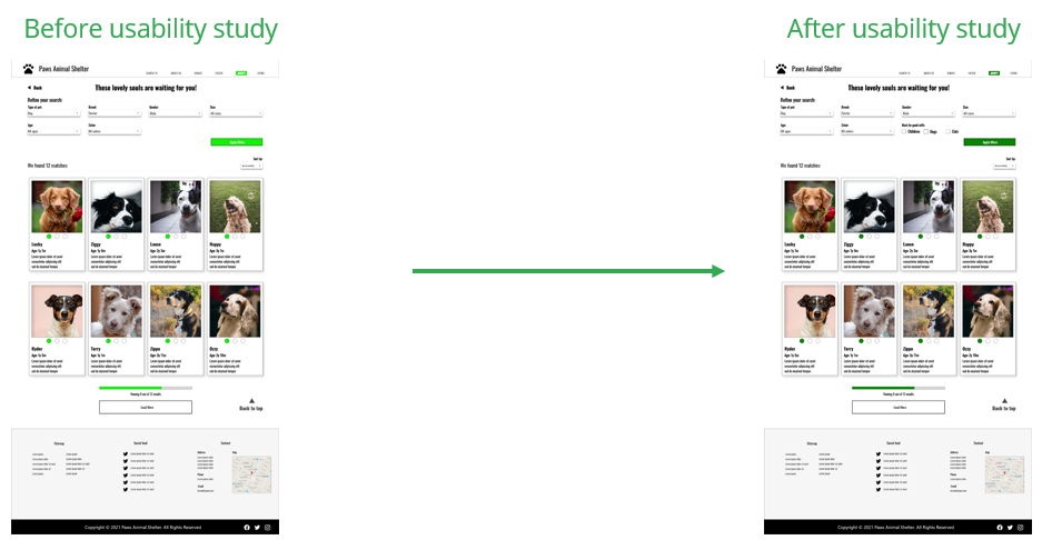
The usability study revealed the need for being able to filter based on how different pets listed for adoption get along with children or other pets, so I added that filtering option.
Mockups - original screen size
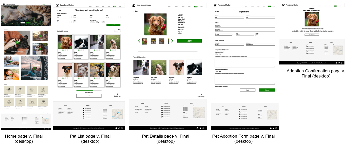
Mockups - screen variations
Accessibility considerations
1. The color contrast between the text color and the background color is of 16:1, which complies with the WCAG 2.1 AAA standard.
2. The color contrast between the text color and background color of primary CTA buttons is 4.8:1, which complies with the WCAG AA standard.
3. The tap targets are at least 40px wide, in order to be easily accessed on touch devices.
Going Forward
Takeaways
Impact
The design looks to offer a cohesive and consistent experience across devices for anyone looking to adopt a pet from an animal shelter.
What I learned
While designing the animal shelter website I learned that the first ideas for the app are only the beginning of the process. Usability studies and peer feedback influence each iteration of the app’s designs.
Next Steps
1. Conduct another round of usability studies to validate whether the pain points users experienced have been effectively addressed.
2. Conduct more user research to determine any new areas of need.
3. Launch the website in order to contribute to the community as much as possible.
Let's Connect!
Thank you for your time reviewing my work on the pet adoption flow for an animal shelter responsive website! If you’d like to see more or get in touch, my contact information is provided below.
Email: paul.tamas@gmail.com
Website: paultamas.design